"Celebrate Difference"
This project was an exercise in the "Editorial Process." We each chose an existing publication and could "edit" them in any way we wanted. In this case I chose "Kingpin" a magazine about skateboarding. I wanted minimal text as I felt that the photography itself should be the focus. I wanted to work with monochrome images with elements of colour added on occasion. I enjoy working in mixed media so I decided to limit myself to 5 materials - black and white acrylic, a scalpel, glue and a black sharpie. I took out all of the ads and focused on the photography as that should be what a skate mag is about - the skating.
Here the image with the stairs folds out to reveal another spread concealed within, which starts the next "article."
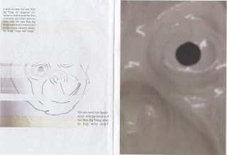
The "Monkey Mag"
For this project we chose three items and a letterpress character (I chose a monkey mask, a galvanised nail and a postcard. The character I chose was a D.) We were given an article from "Emigre" to use as the text source for our magazines. As well as these, we had to use a photograph somewhere in our magazines, it didn't matter how as long as it was visible in some format (This is on the last page under the line drawing of the monkey mask.) I took photographs of the mask for the cover. I intended to cut holes in the eyes but the images didn't quite match up. The page layouts themselves were constructed entirely in my sketchbook then scanned in. Photocopiers and scanners in full effect.
"Skyline"
This next piece was a real pain to scan in to it is shown here somewhat fragmented.
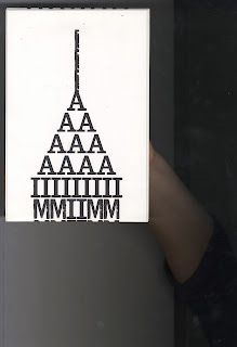
For this project there were two different boxes with pieces of paper in them, one contained words that determined the content of the magazines, the other determined the theme. I chose "Skyscrapers" and the theme I ended up with was "Functional." It could have been worse.
I made my magazine a little narrower than A4, but one long continuous page. The image above folds out to be four times as long. On the cover (which takes up one whole side) a type based homage to the Empire State building is made using the font "Jailbird Jenna." This was the "Cover story"
Above is a rough 'stitch' of the magazine scanned in. The column arrangement is designed to give the impression of a portion of a city skyline, with the images suggesting a collection of clouds above. The way the magazine was set out was to emulate an instruction manual, carrying on the "functional" feel. For the labels/captions I used the font used by the greatest purveyors of instruction manuals IKEA - Futura. There's a hoo-har over them usng Verdana now. I preferred Futura but nevermind. The form emulates the hulking structures that are skyscrapers so the magazine works on different levels.


